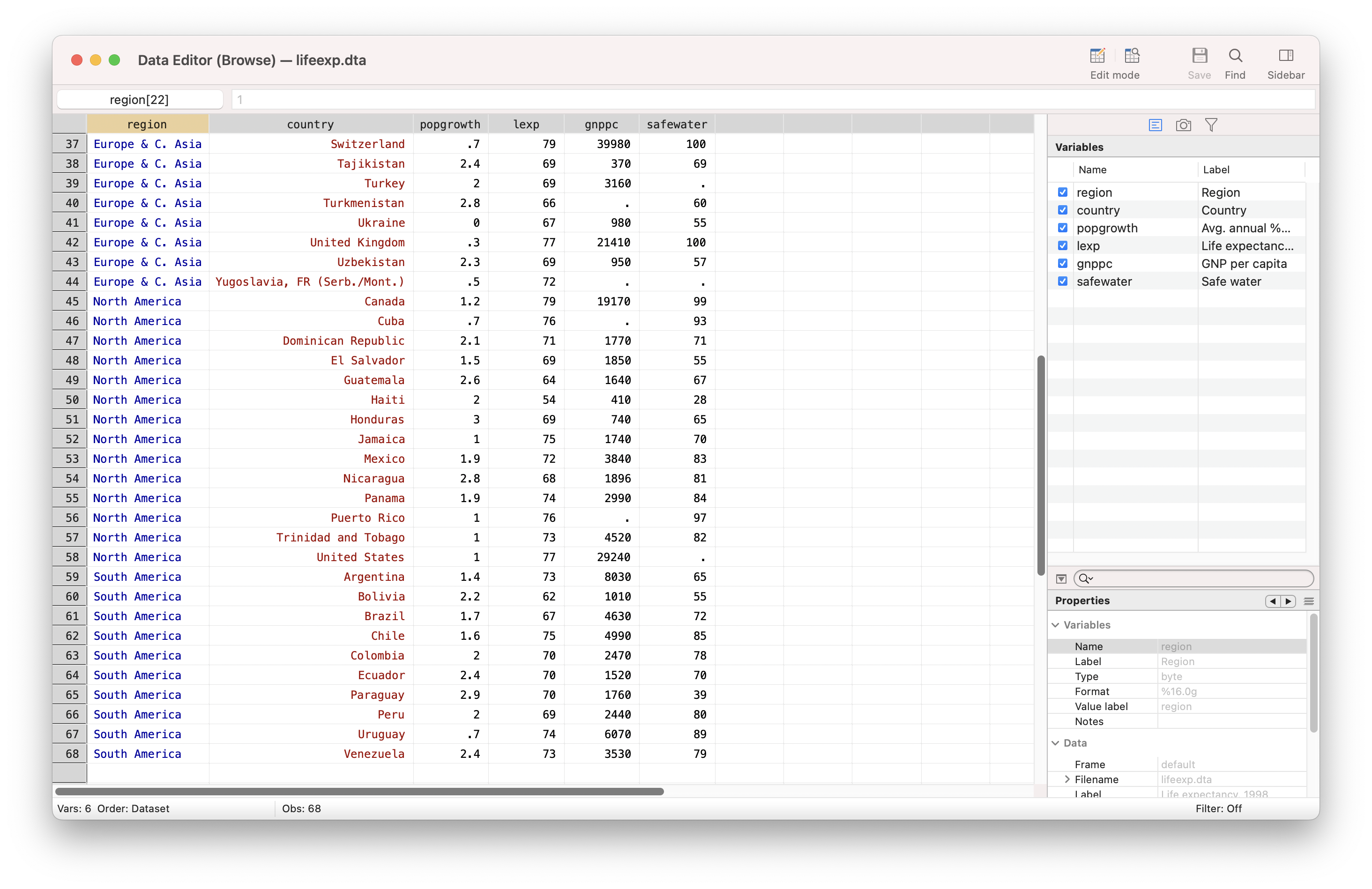
Suppose we have the following dataset that provides the life expectancy (lexp) of each country in each region:
We can draw a bar graph to show the average (or other statistics) life expectancy of each region using two different methods:
Method 1: using the collapse command
|
1 2 3 4 |
sysuse lifeexp, clear collapse (mean) lexp, by(region) graph twoway bar lexp region |
Method 2: using the egen tag command
|
1 2 3 4 5 6 |
sysuse lifeexp, clear bysort region: egen mean_lexp=mean(lexp) egen tag: tag=tag(region) graph twoway bar mean_lexp region if tag==1 |
Method 1 will actually destroy the original data. If we need to keep the original data available for use afterward, Method 2 may be more convenient.


Very helpful. Thanks, Kai!
what if we want the mean by two groups (e.g. firm and year) in a panel data?